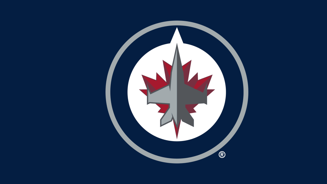
I like the main logo. Especially since the Department of Defense helped in the designe. It looks similar to the Canadian Air Force symbol , which of course is fitting. Not too keen on the other two, what the hey, we have an NHL team and that's all that really matters.
I do like how they stuck a Maple Leaf in every logo though. Very cool.
Yet another reason why they should've been named the Falcons (or something more unique). Why re-invent the wheel on an old franchise tag? Especially with a team that is actually a different franchise coming back to the city.
Of course the retro version will never be touched with any new logo that is created. My feelings are that the new logo is very military styled and may have been better. The top right is the best IMO so hopefully we will see that often.
I really didn't think they'd change the entire logo, but considering they didn't want to use the "JETS" to begin with I can understand the move. A fair compromise I'd say.
Over 2,000 people lined up yesterday to buy t-shirts and hats with the new logo. Crazy. Plus these people where paying $6-10 for parking.
Paying that much for parking in a smaller city is fucken ridiculous if you ask me. 600 000 people is really not that many when you consider there really aren't that many townships crowding the area.
Agree with you. New logos never compare to the older ones so why complain??? I'm happy that they didn't name the team something stupid like the Thrashers or the Wild. Stickign with 'Jets' and changing the logo was the correct move IMO.